I wanted to see if my love of drawing hair would translate into drawing other things that are similar in texture, specifically, grass and fur. Turns out, yep. I may be slightly crazy, but this actually was a lot of fun to draw. Plus, foxes! Cute!
Tuesday, August 28, 2012
Monday, August 20, 2012
Thursday, August 09, 2012
Character sketches - Joy and Sadness
Some character sketches for a sketch challenge - depicting "joy" and "sadness." It was a good exercise in character consistency.
Thursday, August 02, 2012
Drawing curly hair
I decided to draw some curly hair. For no reason, really, other than wanting to see how to draw curly hair. My only insights into the process are: draw a bunch of squiggly shapes. Then, draw a lot of little short curvy lines going one way and then the other. Make some parts darker and leave some lighter. After doing this for a long time, you will have a nice drawing of curly hair.
Tuesday, July 31, 2012
Princess Character Studies
Some character studies for a sketch challenge. I really like drawing this little princess. Sadness, Fear, Anger, Surprise, Joy and Disgust were the emotions I had to express. You can probably figure out which is which for yourself.
Sunday, July 29, 2012
Some miniature portrait paintings
I did these two little portraits recently for a friend's birthday. They are in little metal frames that I purchased years ago somewhere in the American Southwest; they have a glass door that is open for the purposes of photographing them.
Friday, June 29, 2012
Monday, June 25, 2012
Monday, June 18, 2012
Tuesday, June 12, 2012
Alphabooks - Mr. Darcy
I chose Mr. Darcy for Alphabooks this week (of course I did Mr. Darcy, I had no choice, really). Mr. Darcy, regency hunk and eligible bachelor. And that's the Jane Austen font in use - based on her handwriting!
In other Austen related news, The Guardian had an article about a portrait of Jane Austen at age 13, and inexplicably decided to link to a comic on this very blog. http://www.guardian.co.uk/books/2012/jun/08/jane-austen-portrait-as-young-girl (my link is in the last paragraph).
Thursday, June 07, 2012
Illustration Friday sketch
Alas, I didn't get my Illustration Friday done in time... here's the sketch of what it would have been if I had gotten my act together in time. Oddly enough, the prompt was "Hurry!" I guess I should have taken that to heart a bit more.
Alphabooks - Cat Chant and Chrestomanci
Well, it's the letter C this week for Alphabooks - and I chose Cat Chant (whose real name is Eric) and Chrestomanci (whose actual name is Christopher Chant), from Charmed Life by Diana Wynne Jones.
Chrestomanci is quite dapper, and I had quite a crush on him as a kid, and to be honest, still do. He's just so dreamy. This is also quite a bit what I imagine Mr. Darcy to look like. Probably my Pride and Prejudice obsession all stems from reading Charmed Life.
Thursday, May 31, 2012
Alphabooks - Becky Sharp
My entry for Alphabooks this week - B is for Becky Sharp from Vanity Fair by William Thackeray.
Wednesday, May 30, 2012
Recently completed project - Surly Sheep
Still Tweaking
Ever trying to refine my style... I made some subtle changes to this one. I added some shading in colored pencil and graphite to give it a little more depth and texture. I think I like it better. The old version is here.
Tuesday, May 08, 2012
Illustration Friday - Hitched
Wow! Participating in Illustration Friday for two weeks in a row! Shocking!
This is just a pencil sketch colored in Photoshop... and a few character
studies for the same girl. There's something about drawing angry
children that I find very entertaining.

Thursday, May 03, 2012
Wednesday, May 02, 2012
Recently completed project - Miss Maureen
I recently finished this illustration project for Miss Maureen, an Australian musician who is releasing her debut album of children's music. It was a really fun project to work on, not only because I got to draw a mermaid, but also because I got to have Skype meetings with them and learn all sorts of bizarre Australian cultural tidbits. I illustrated 20 characters, one for each song, as well as a few other incidental illustrations and an album cover.
Here are just a few of my favorite images, and the album cover I designed for them. Website design and logo design was done by Marke. All 20 of the character images can be seen at MissMaureen.com.
Thursday, April 26, 2012
Putting together a physical portfolio - for Illustrators
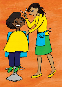
I wanted to create a post on putting together a physical illustration portfolio, since I had been furiously Googling how to do so and felt like there was not enough information out there for illustrators.
So, here's what I did (please forgive the terrible pictures):
I bought a screwpost presentation book - I got this really pretty one (the Pina Zingaro Vista from Dick Blick) that has a translucent cover, so you can see the first image even before you open the book. I agonized about whether or not I should have a title page with my name and contact info and decided that I would rather just start out with an image.
I used Epson double sided matte presentation paper and printed all my images full bleed (allowing for about 1/2" on the left side of the page that would be hole punched and stuck into the book. I used a folding bone to score the pages so they would lie flat. I also used double stick tape and adhered the pages together (in particular the double page spreads) so they would be perfectly lined up and not shift around.
The reason I used the double sided paper is so I could stretch my landscape images across the page - I picked up the tip about the double sided paper from Eliza Wheeler's great posts about her portfolio: (http://wheelerstudio.com/category/portfolio-2/) :
I picked up another suggestion from my online critique buddy Donna Jeanne Koepp (http://www.whitewolfstudioart.com/) to print any images that were not full bleed on a black background. I just dropped the images onto a black background in Photoshop and printed it out. I made sure that any landscape format images that I didn't print across two pages were printed smaller on a portrait size piece of paper, so the book didn't need to be turned in order to be viewed.
I have a couple of different styles in my portfolio, so I tried to arrange my images in such a way that they would flow logically from one image to the next. I also had two black and white images that I interspersed with the color images. I tried to start with one of the strongest pieces and end with the second strongest. Finally, don't put anything in your portfolio that you are not excited about. As I was developing my style it really helped having my critique pals Donna and Brian Bowes (http://studiobowesart.com/) figure out which images were working together and which I should cut.
The last piece in the portfolio:
Subscribe to:
Posts (Atom)