I wanted to create a post on putting together a physical illustration portfolio, since I had been furiously Googling how to do so and felt like there was not enough information out there for illustrators.
So, here's what I did (please forgive the terrible pictures):
I bought a screwpost presentation book - I got this really pretty one (the Pina Zingaro Vista from Dick Blick) that has a translucent cover, so you can see the first image even before you open the book. I agonized about whether or not I should have a title page with my name and contact info and decided that I would rather just start out with an image.
I used Epson double sided matte presentation paper and printed all my images full bleed (allowing for about 1/2" on the left side of the page that would be hole punched and stuck into the book. I used a folding bone to score the pages so they would lie flat. I also used double stick tape and adhered the pages together (in particular the double page spreads) so they would be perfectly lined up and not shift around.
The reason I used the double sided paper is so I could stretch my landscape images across the page - I picked up the tip about the double sided paper from Eliza Wheeler's great posts about her portfolio: (
http://wheelerstudio.com/category/portfolio-2/) :
I picked up another suggestion from my online critique buddy Donna Jeanne Koepp
(http://www.whitewolfstudioart.com/) to print any images that were not full bleed on a black background. I just dropped the images onto a black background in Photoshop and printed it out. I made sure that any landscape format images that I didn't print across two pages were printed smaller on a portrait size piece of paper, so the book didn't need to be turned in order to be viewed.
I have a couple of different styles in my portfolio, so I tried to arrange my images in such a way that they would flow logically from one image to the next. I also had two black and white images that I interspersed with the color images. I tried to start with one of the strongest pieces and end with the second strongest. Finally, don't put anything in your portfolio that you are not excited about. As I was developing my style it really helped having my critique pals Donna and Brian Bowes (
http://studiobowesart.com/) figure out which images were working together and which I should cut.
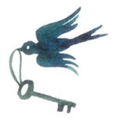
The last piece in the portfolio:


5 comments:
Congratulations Liz!
I see that you took the top honors, best in show, for your portfolio at the SCBWI Western Washington Conference! Whoot whoot!
Great post, and I am going to 'borrow' some of your techniques for my next portfolio review too!
Cheers,
Brian
Congratulations, Liz! It was great to meet you at the conference - and your work is amazing. I hope the recognition you received brings opportunities your way! Best of luck to you.
Thank you both!
And Laurie, it was great meeting you at the conference, too! Love your work!
Great post; thanks for sharing what you've learned! I've been thinking about making a physical portfolio and really didn't know where to start. Your work is fantastic and your book looks beautiful!
Post a Comment